Crafting the Provenio Health Brand: Design, Messaging, and Market-Readiness
Introduction
When it comes to building a brand from the ground up, consistency, design, and strategy are key. I had the privilege of working on Provenio Health to design and develop the full front-end of the brand. This included creating the Provenio Health logo, designing their website, and crafting brand messaging in collaboration with the CEO and CRO.
Designing the Provenio Health Logo
The logo is the cornerstone of any brand, and for Provenio Health, I wanted to ensure it reflected their mission, values, and aspirations. Designing this logo involved balancing my modern minimalist aesthetic while embedding deeper meaning into the design.
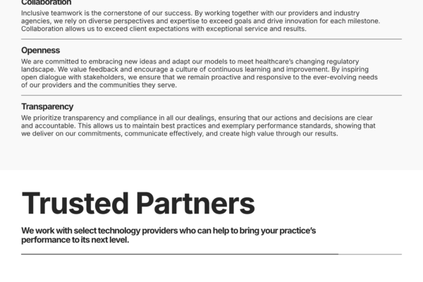
Provenio, meaning “to come forth, appear, and arise,” is reflected in the thoughtful design of the logo. The minimalist typography features an open “o,” symbolizing growth and the ability to thrive, while the upward alignment of three dots signifies collaboration, progress, and prosperity. These elements work in harmony to visually represent the core values of Provenio Health—collaboration, openness, and transparency—creating a logo that embodies the company’s mission to inspire trust and create positive outcomes.
- The opening of the “O” symbolizes openness and transparency, key elements of Provenio’s brand identity.
- The three circles growing upward and outward from the “O” represent growth and prosperity while also embodying collaboration, as the circles interact harmoniously in the design.
While the logo may look simple, it required significant thought and creativity to align it perfectly with Provenio Health’s vision and values.
The Colors of Provenio Health
Color plays a crucial role in establishing brand identity, and for Provenio Health, I chose an ocean turquoise as the primary color. This color represents calmness, comfort, and purity—qualities that align with the brand’s mission.
By leveraging these aesthetics, I aimed to create an immediate sense of trust in the brand. This visual introduction, supported by Provenio’s messaging and positioning, cements its credibility in the revenue cycle management space.
Building the Website: A Seamless User Experience
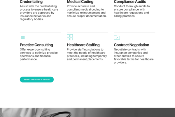
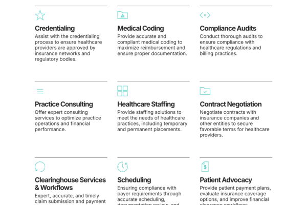
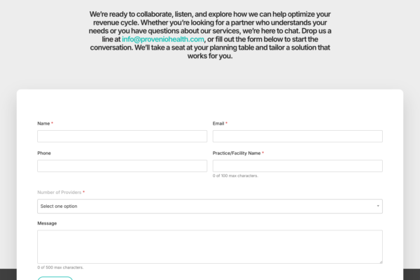
The Provenio Health website was designed to align with the brand’s messaging and mission, combining a minimalist aesthetic with user-friendly navigation. Each page was carefully crafted to ensure visitors have a seamless experience while reflecting the company’s professionalism and innovation. Rajat Wadehra led the development and functionality of the site, while I focused on shaping its visual aesthetics and design.
Collaborating on Brand Messaging
Working alongside Provenio Health’s CEO and CRO, I played a vital role in creating the brand messaging. Together, we developed clear and impactful value propositions that highlight Provenio Health’s commitment to excellence and innovation.
Developing Comprehensive Brand Guidelines
To ensure Provenio Health is prepared for market entry, I created detailed brand guidelines. These guidelines cover logo usage, typography, color schemes, and tone of voice to maintain consistency across all platforms and communications. This ensures that everyone working on the brand has a clear roadmap to follow, helping Provenio Health present a cohesive and professional image.
Final Thoughts
Designing the Provenio Health brand was a rewarding experience that combined creativity, strategy, and collaboration. From the logo and website to the brand guidelines, every element was crafted to position Provenio Health as a trusted and innovative player in the healthcare space.
To learn more about Provenio Health and see the full website in action, visit proveniohealth.com.


